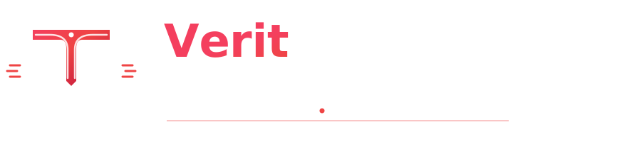
Engineered with exact mathematical mirror symmetry for the V and T emblem, completely eliminating the old unintentional "W" shape and featuring your requested dual tagline:
BELIEVE IN BRIDGING • INNOVATION & INTEGRITY.
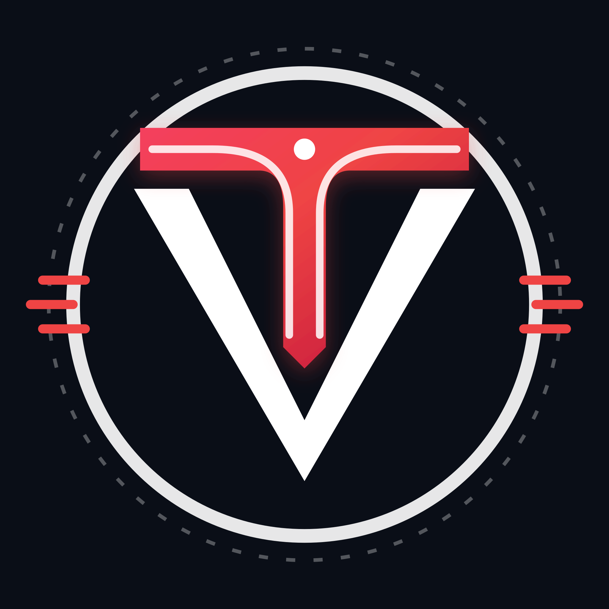
Curved suspension tracks branching symmetrically left and right, creating an unmistakable capital "T" floating inside the white "V" chevron cradle.
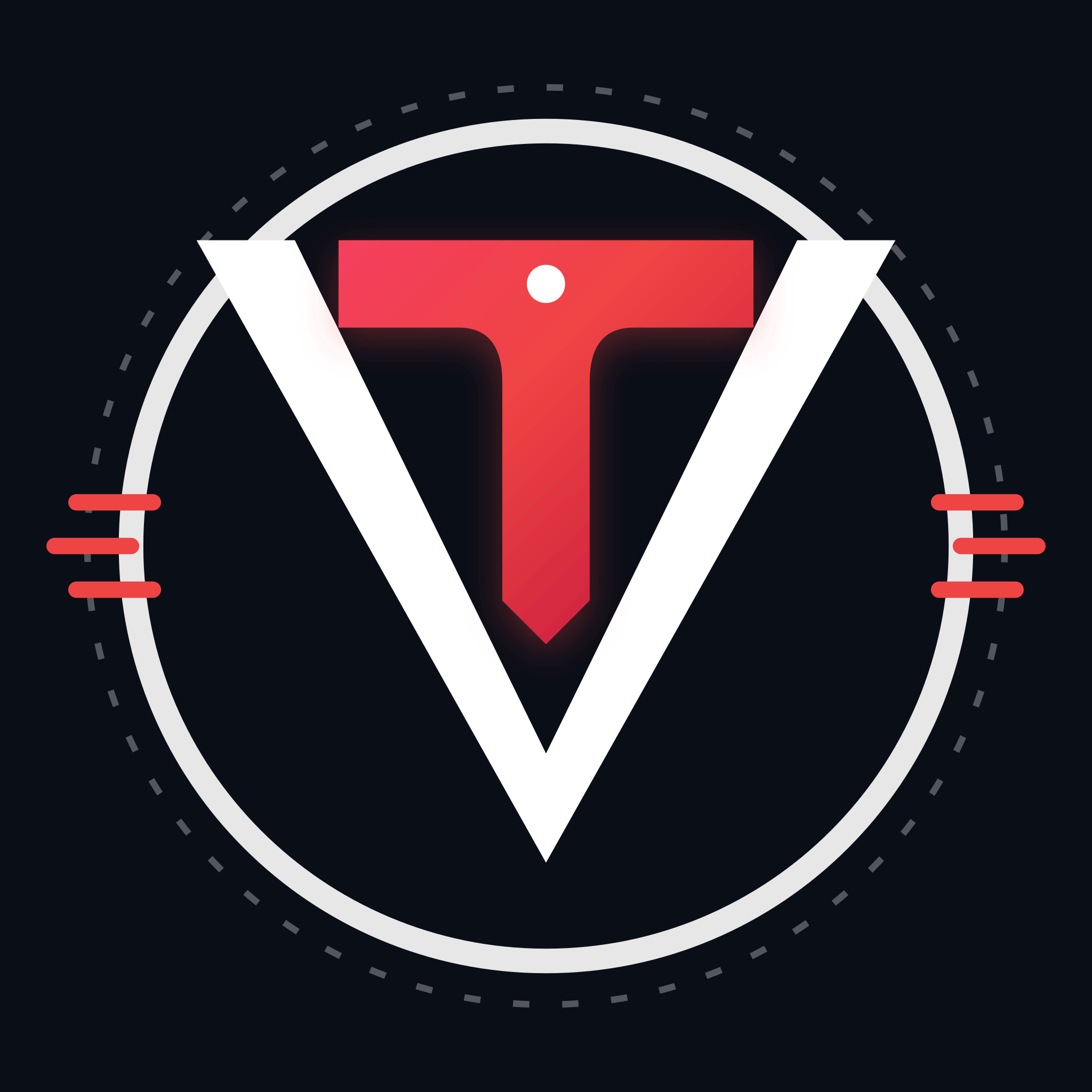
High-contrast solid Crimson Red "T" with floating tech core dot. Stripped of internal lines for ultra-high legibility on app icons and mobile favicons.
The crossbar spans horizontally across the top aperture, supported from below by 45° chamfered "V" chevron wings. Imparts massive architectural scale and structural authority.
Visual proof addressing your feedback: the center white pillar that previously created a "W" has been completely eliminated. Both letters now stand with 100% individual clarity.
A single monolithic 2-wing chevron framing the outer circle. Zero center lines — impossible to misread as a "W".
A bold Crimson Red capital "T" with horizontal crossbar, vertical stem, dual suspension bridge cables, and keystone terminal.
The "T" floats suspended inside the "V" notch with constant calibrated negative space, achieving 100% mathematical mirror symmetry.
How the 2000px 4K square emblem scales across digital touchpoints.
Tell us about your project requirements